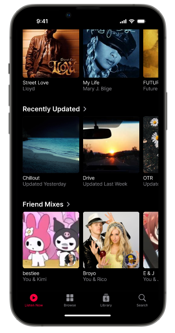
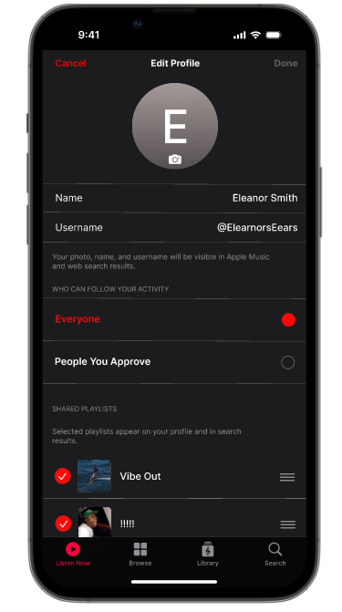
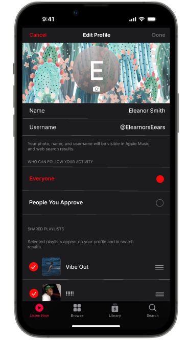
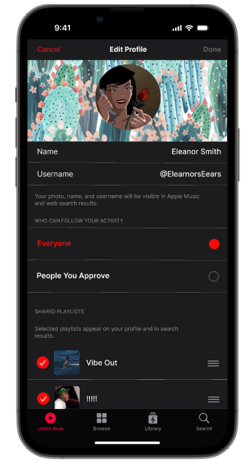
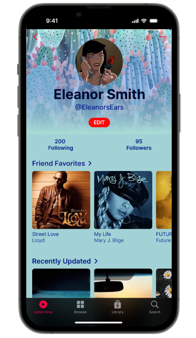
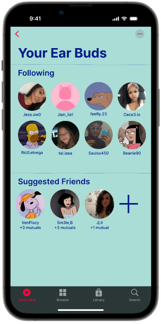
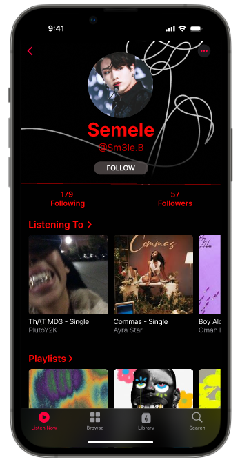
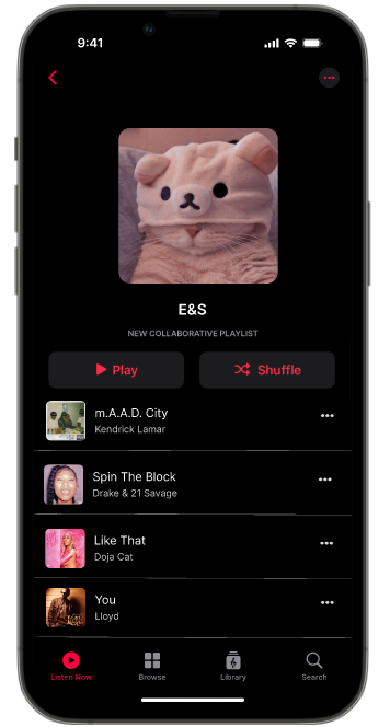
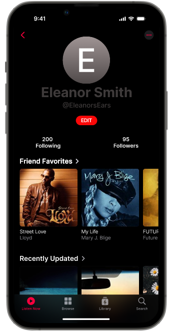
My goal was to enhance its social features and personalization options, leading to two key additions: profile customization and shared playlists. I believe these features would address current user desires and elevate the overall experience. I chose to integrate profile customization into Apple Music because users increasingly seek ways to express themselves within the apps they frequent. While Apple Music offers basic profile elements, I envisioned a more robust system allowing users to select avatars, showcase their favorite artists or genres, and even write a short bio. This would transform a static user icon into a dynamic representation of their musical identity, fostering a greater sense of community and personal ownership within the app.

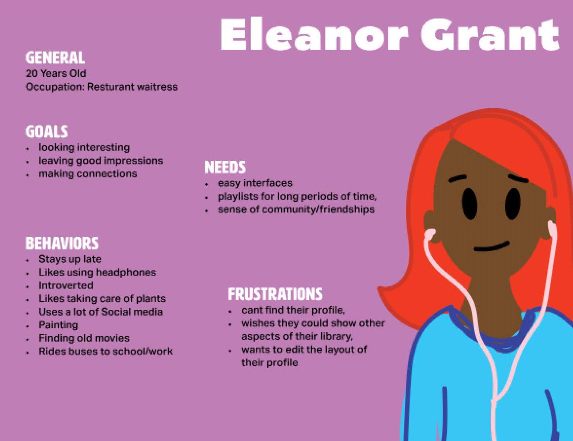
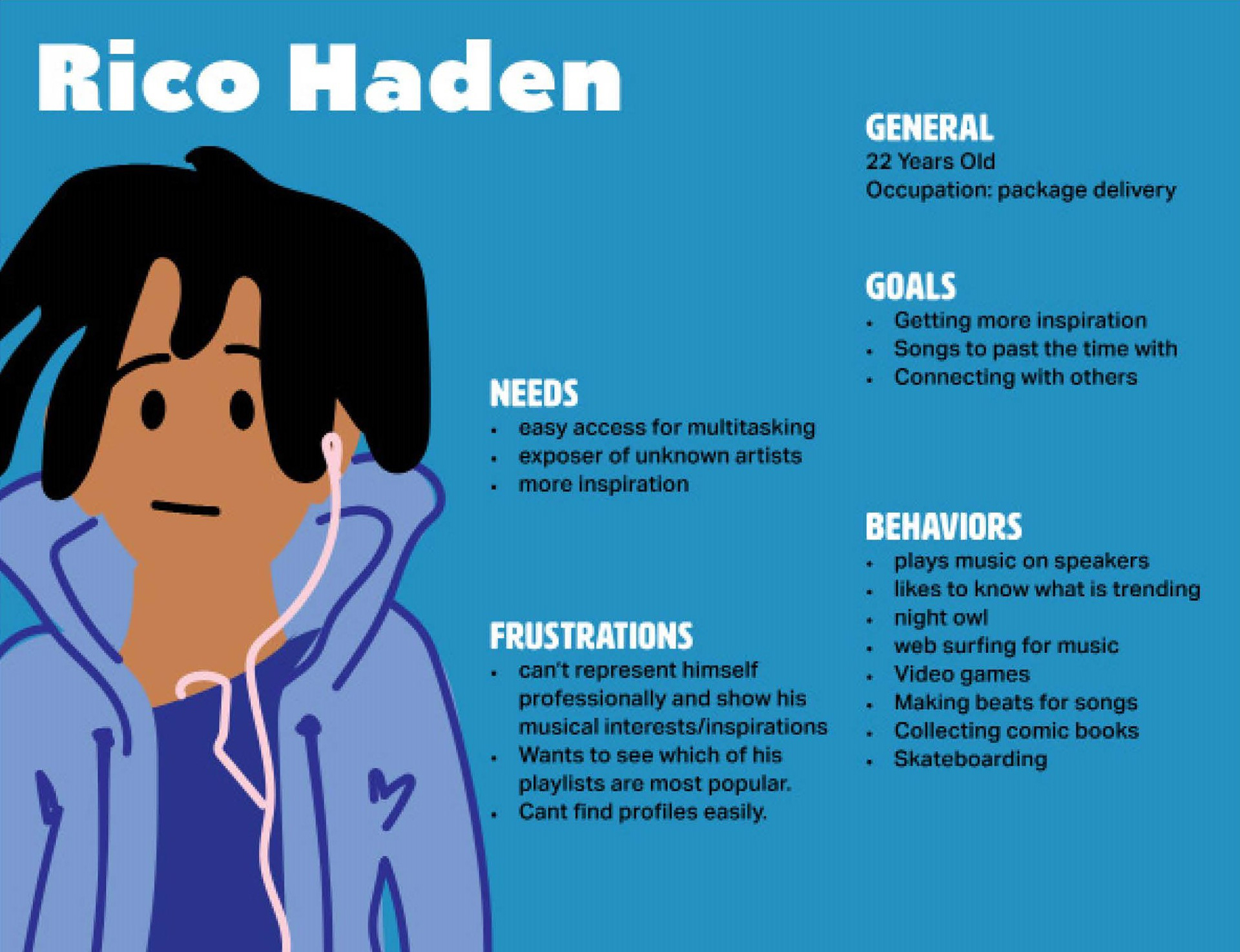
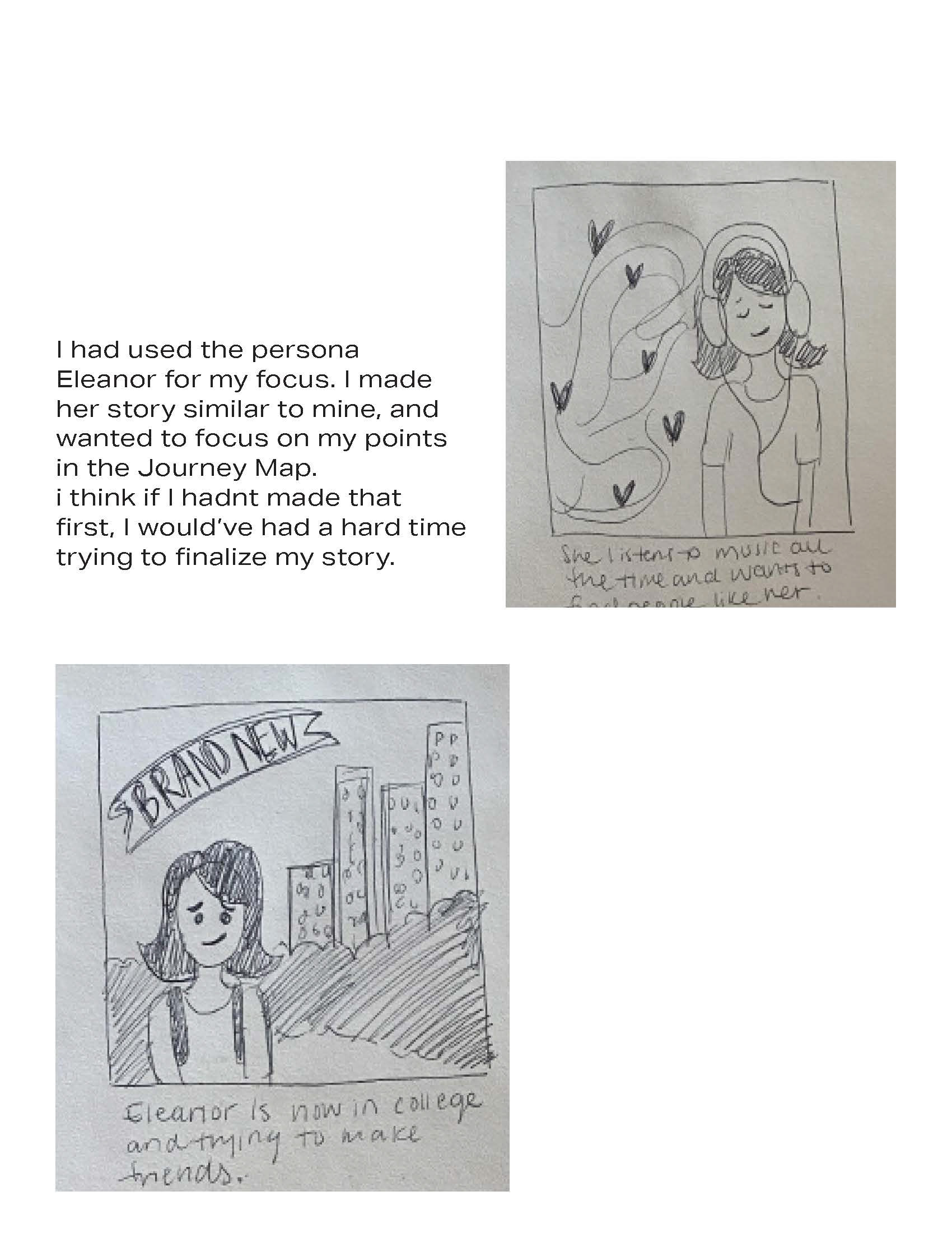
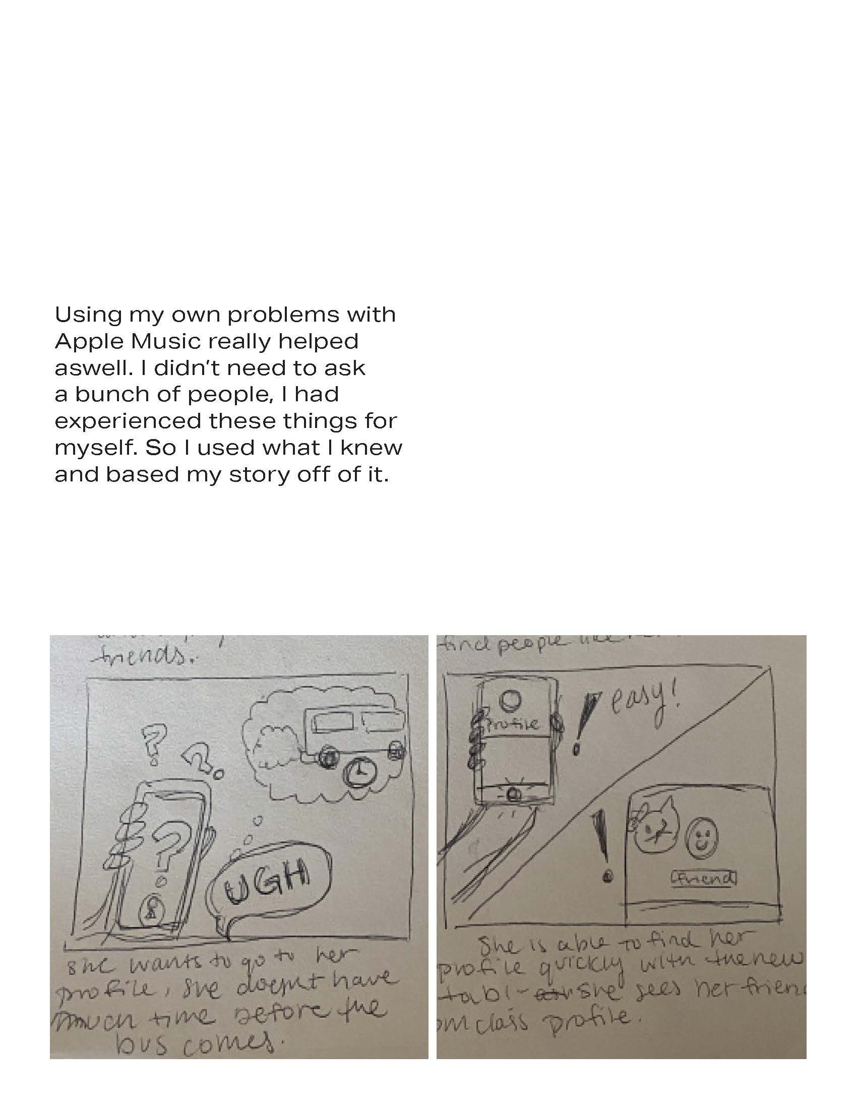
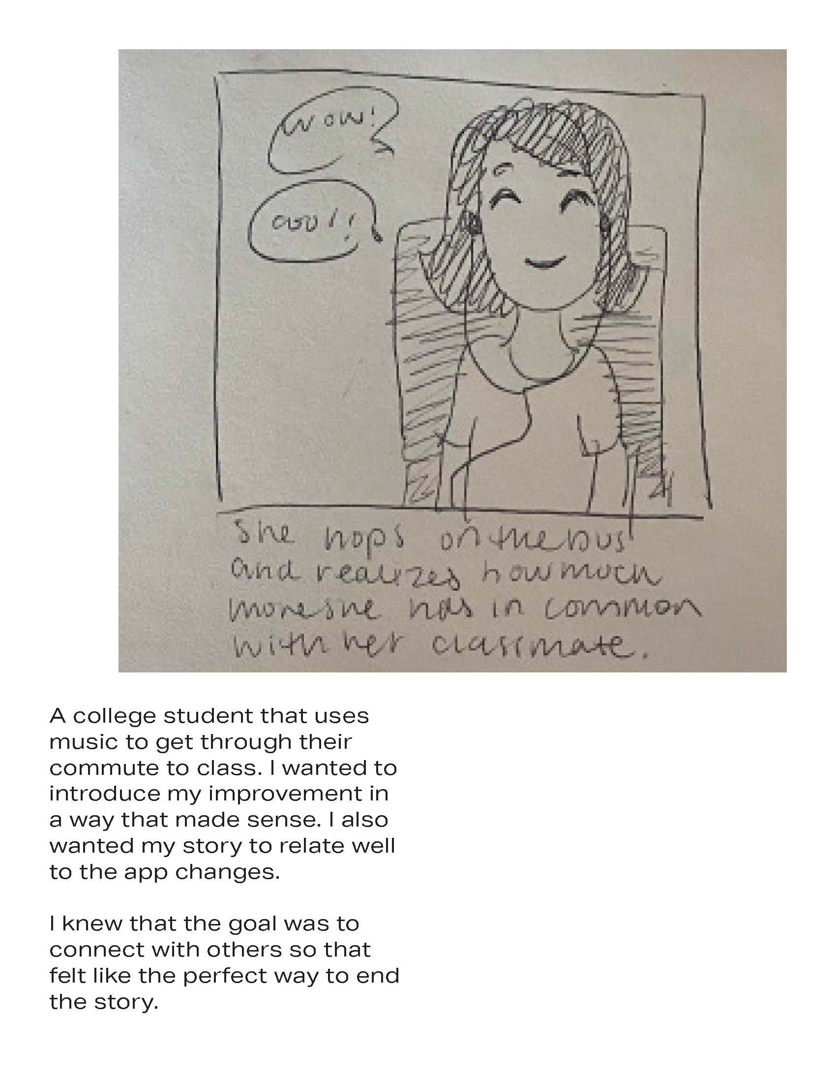
This led me to create user personas. I started by sketching out different archetypes of Apple Music users, considering their current habits, frustrations, and aspirations. For instance, I envisioned a "Social Sharer" who loves discovering new music with friends but finds the current sharing features cumbersome, or a "Creative Curator" who spends hours perfecting playlists and wants more ways to personalize their profile and collaborate. By stepping into their shoes, I could better empathize with their needs and ensure that the new profile customization and shared playlist features directly addressed real user pain points and desires.
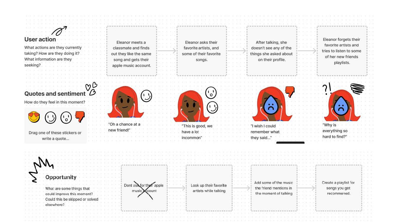
With these user personas as my compass, I then delved into mapping out the user flow for both existing and proposed functionalities within Apple Music. This involved meticulously charting the steps a user would take to accomplish specific tasks, from launching the app to navigating through their library, discovering new music, and, crucially, engaging with the new profile customization and shared playlist features. By visualizing these paths, I could clearly identify potential pain points in the current user journey and pinpoint opportunities to streamline interactions.
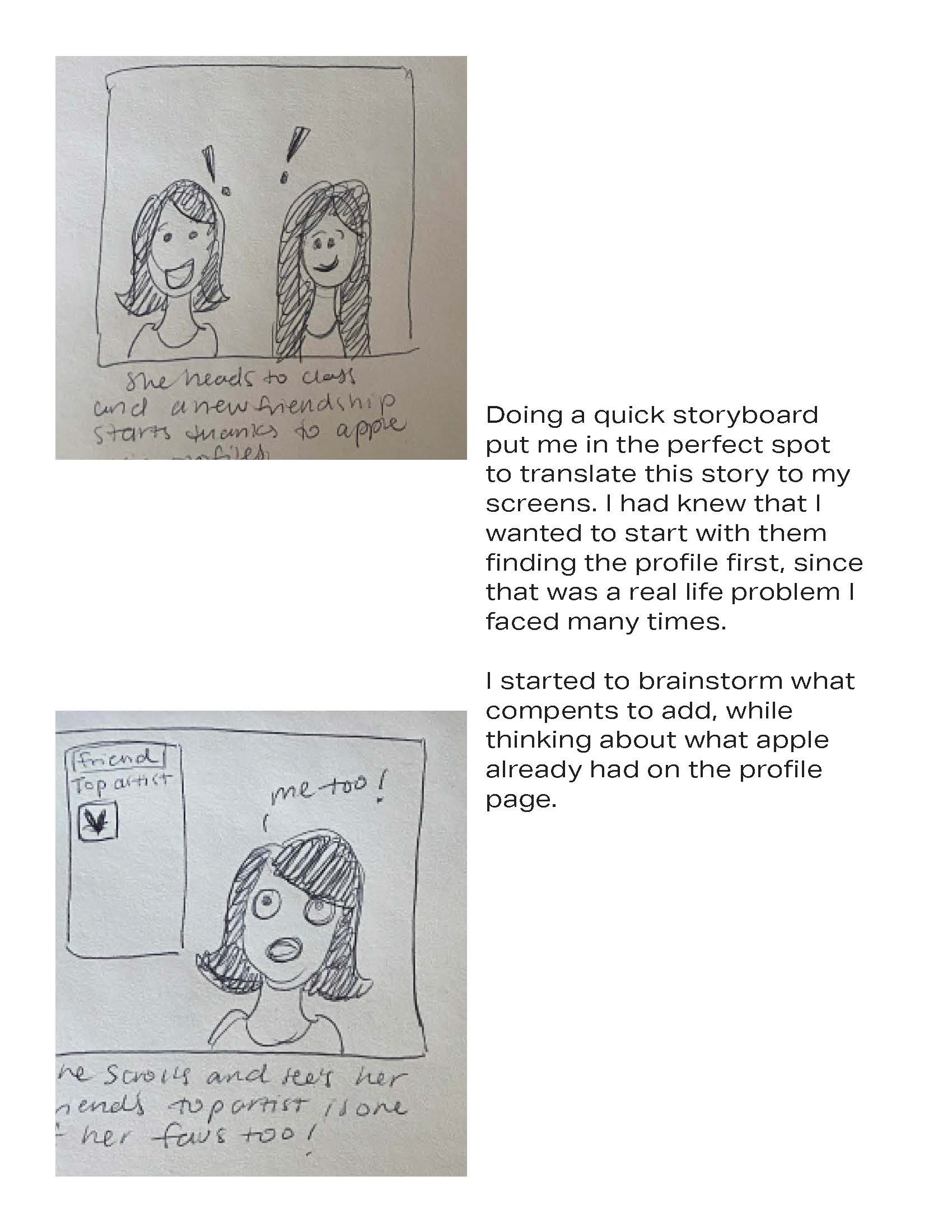
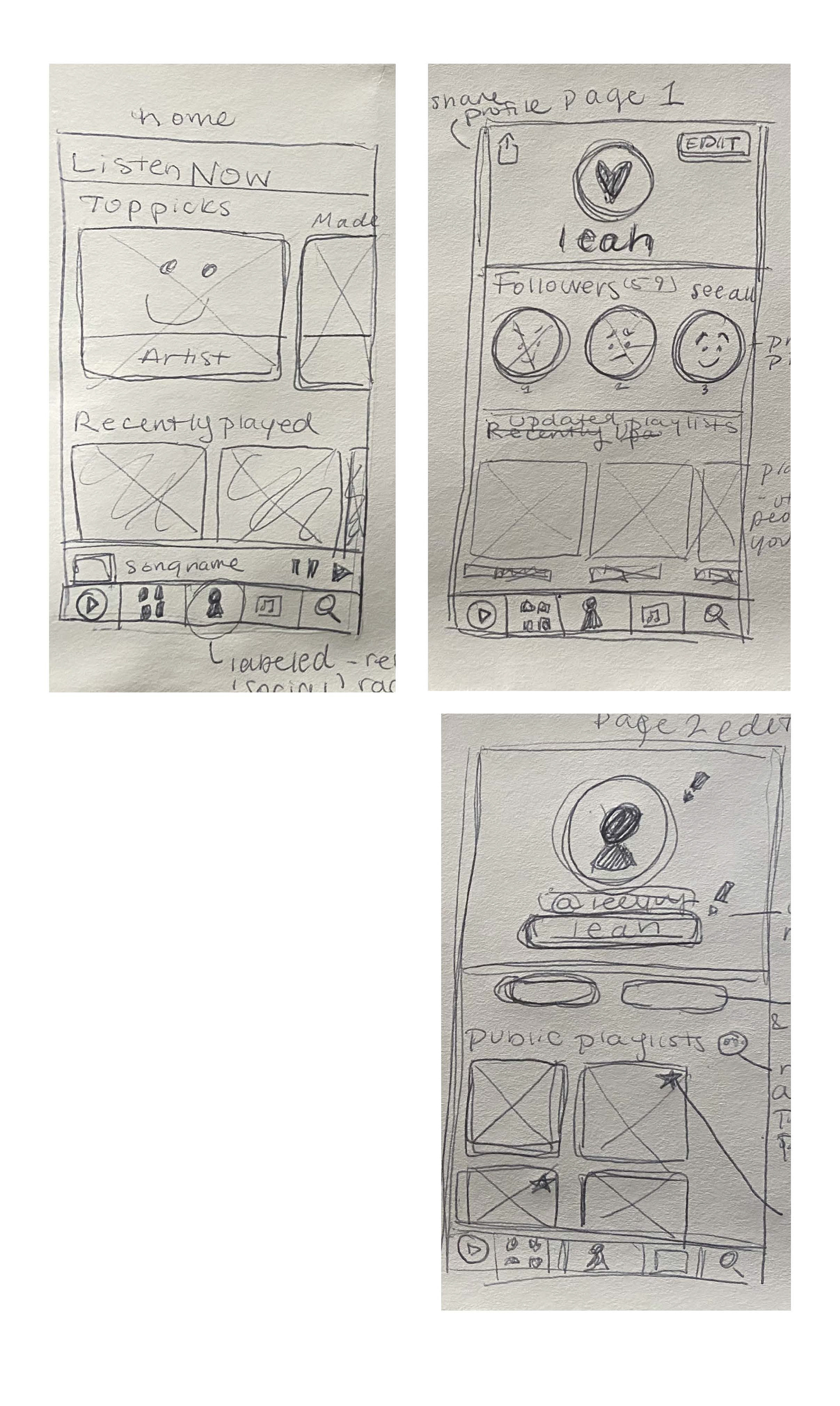
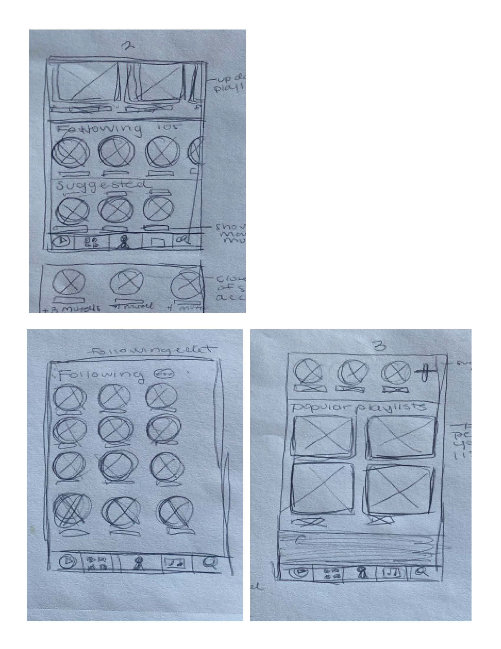
I moved into the crucial phase of sketching out screens. This wasn't about creating pixel-perfect visuals, but rather rapidly iterating on layout and functionality. I grabbed a pen and paper (or sometimes a digital sketching tool) and began to block out the key elements for each proposed screen. For the profile customization, this meant exploring different arrangements for avatars, bios, and showcasing top artists. For shared playlists, I sketched how users would invite collaborators, view real-time changes, and interact with comments.
The beauty of this low-fidelity approach was its speed and flexibility. I could quickly sketch multiple variations of a single screen, compare them, and discard ideas that didn't serve the user's goals. This process helped me answer fundamental questions: "What absolutely needs to be on this page?" "What is the primary action a user should take here?" "How will the user navigate from this screen to the next?" By focusing on content hierarchy and functional placement, I ensured that the foundation of the redesigned Apple Music experience was intuitive and user-centric before investing time in detailed visual design.
Using Figma, I meticulously laid out the user interface elements, focusing purely on functionality, content arrangement, and information hierarchy. These wireframes served as the blueprints for the redesigned Apple Music experience, allowing me to test different layouts and ensure seamless navigation without the distraction of colors or elaborate visuals. It was during this phase that I solidified the precise placement of buttons, text fields, and image placeholders, ensuring every component served a clear purpose within the user flow.
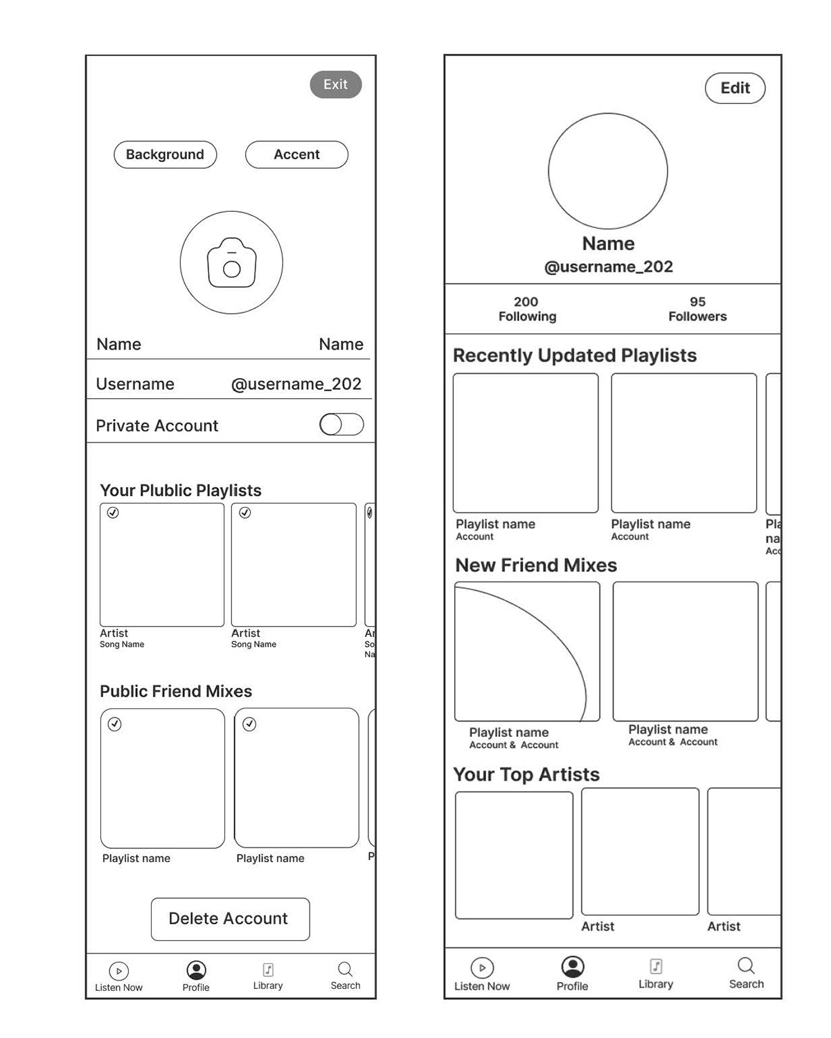
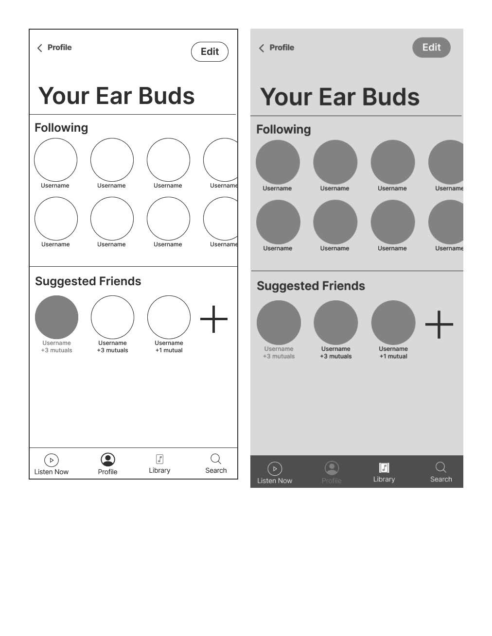
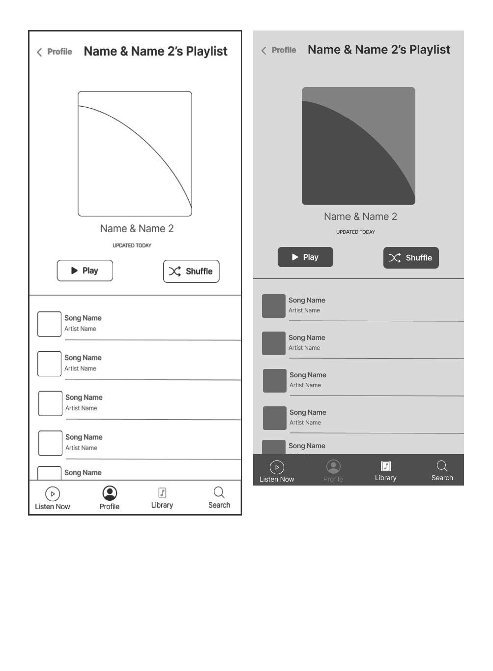
This is where the visual design truly came to life. I started by applying Apple Music's existing design language – its clean aesthetic, signature typography, and familiar iconography – but pushed it further to integrate the new features seamlessly. I experimented with color palettes to differentiate between personal and shared content, chose compelling imagery for profile customization options, and refined interactive elements to feel intuitive and engaging. The goal was to create an experience that felt both fresh and familiar, enhancing the app's appeal while maintaining its core identity. This meticulous attention to detail in every pixel ensured the final designs were not only functional but also visually appealing and delightful to interact with.
Finally, with these polished and interactive screens in hand, I brought the entire experience to life by creating a demonstration video of the new features. This video walks you through the redesigned user flows, showcasing how seamlessly profile customization and shared playlists integrate into Apple Music. You'll see the user journey unfold, from personalizing a profile to collaboratively building a playlist, giving you a dynamic and tangible sense of the improved user experience.