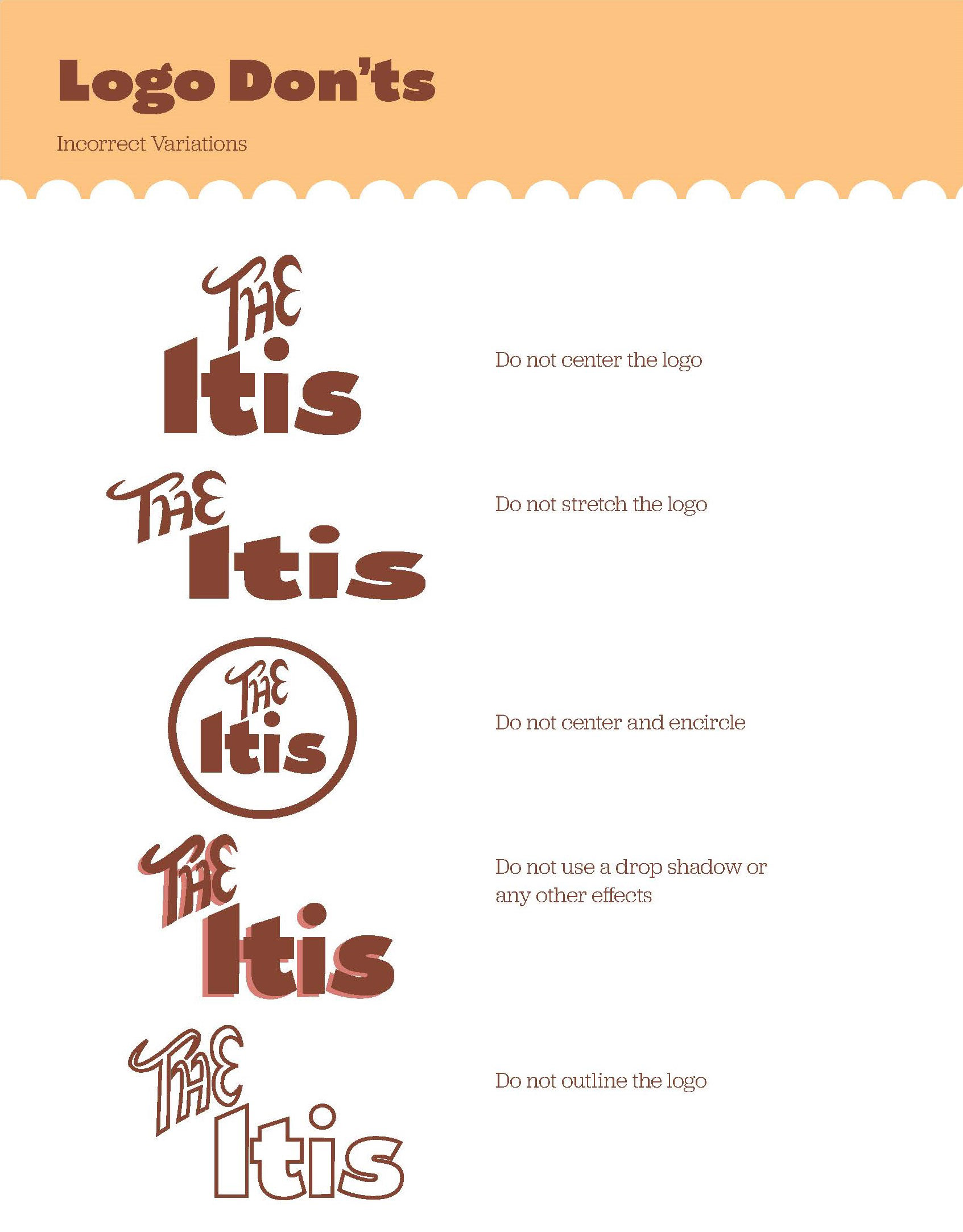

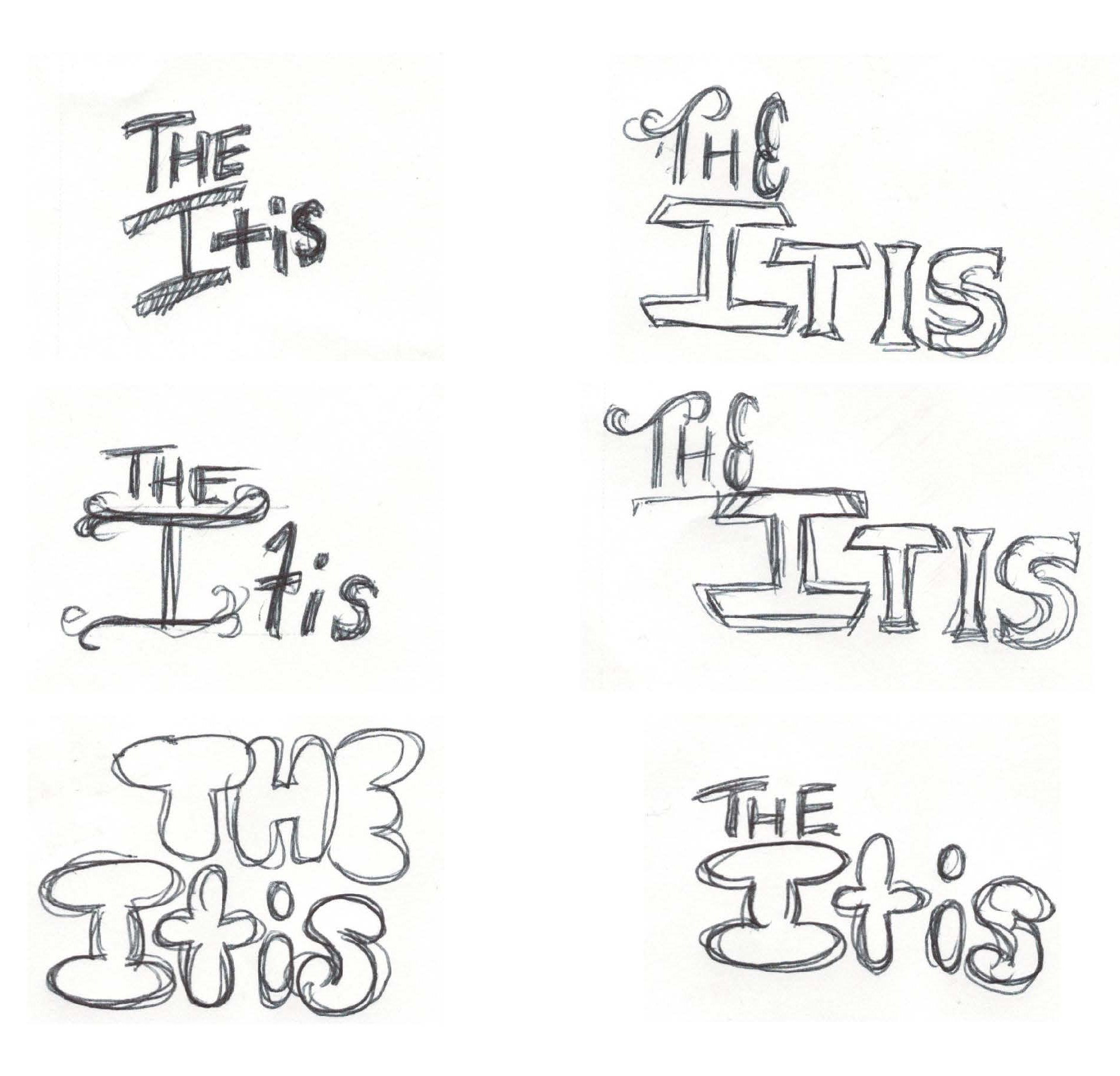
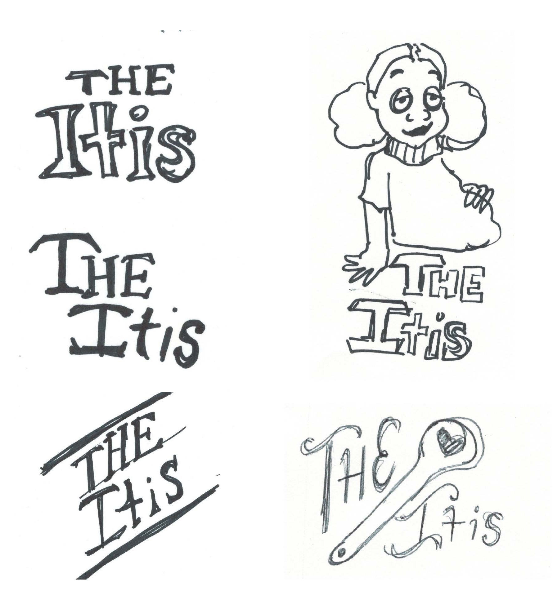
I began the branding process for "The Itis" by sketching various logo concepts, experimenting with different symbols, and trying to capture the essence of soul food. After several iterations, I realized that a purely typographic logo would best convey the warmth, simplicity, and authenticity I wanted the brand to represent.
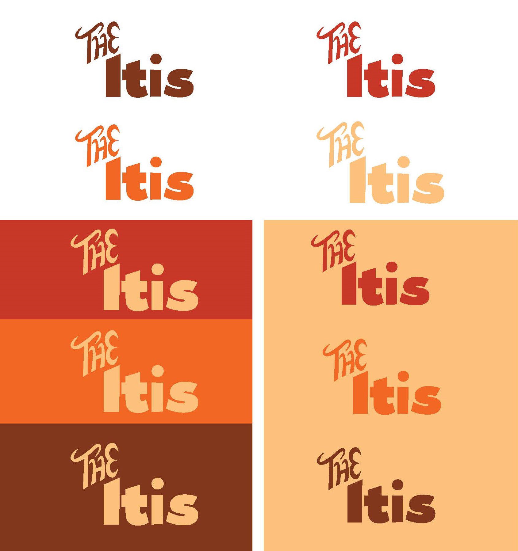
Focusing on bold, flowing letters that reflect the comfort and richness of soul food, I refined the typography until it felt like the perfect fit. This minimalist approach allowed the name to take center stage, creating a strong and memorable visual identity for the restaurant.


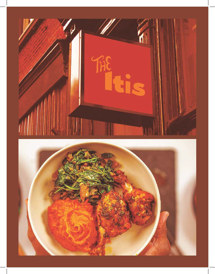
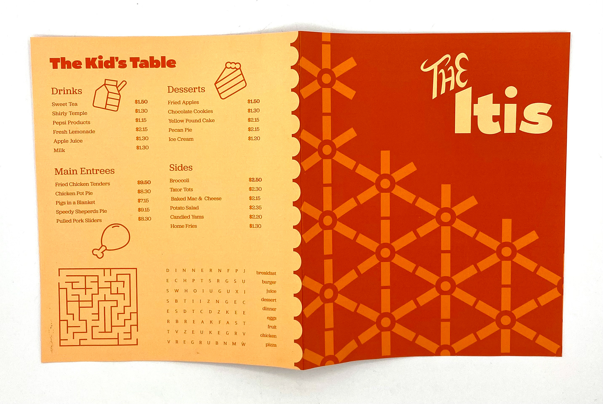
To create a menu that truly reflected the essence of soul food, I had meaningful conversations with my family about their favorite dishes and the meals that had shaped our traditions. I also drew from my own memories of gathering around the table, savoring the comforting flavors that brought us together. These conversations and memories served as the foundation for the menu, ensuring that each dish was not only delicious but also nostalgic and familiar. From classic fried chicken to savory collard greens, the menu became a reflection of the flavors and stories that shaped my upbringing.
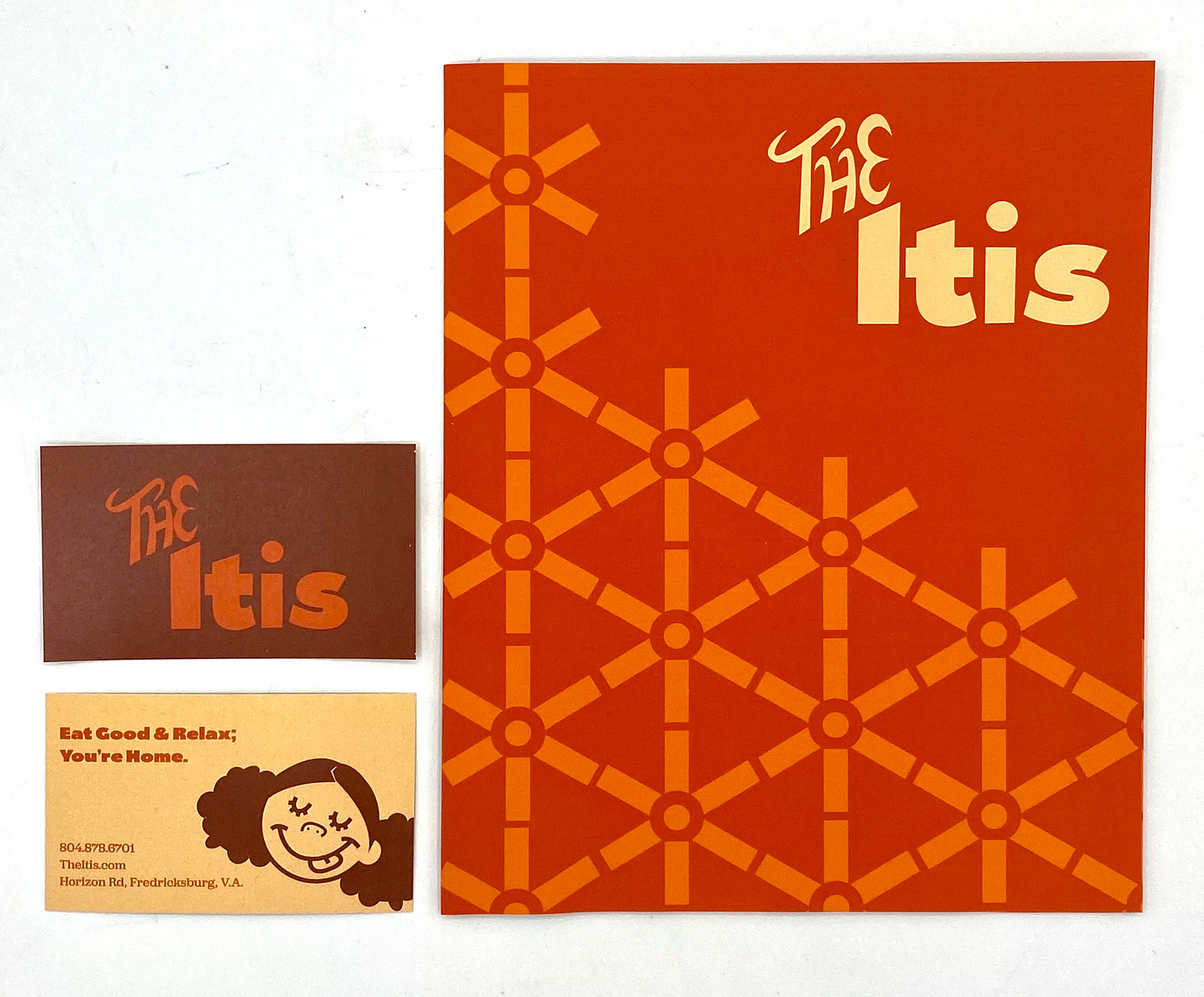
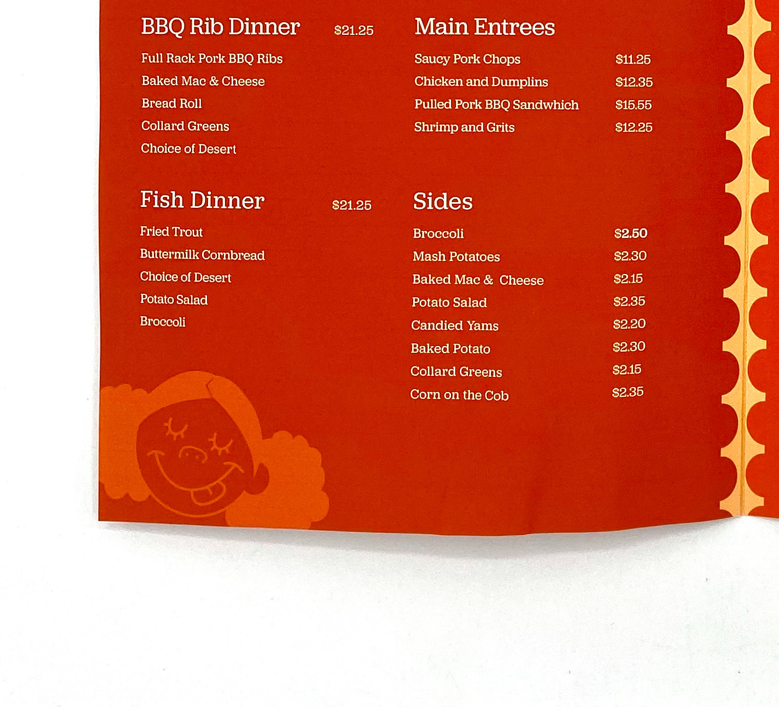
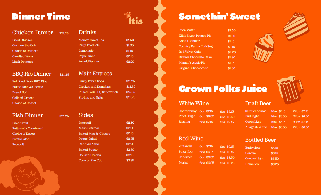
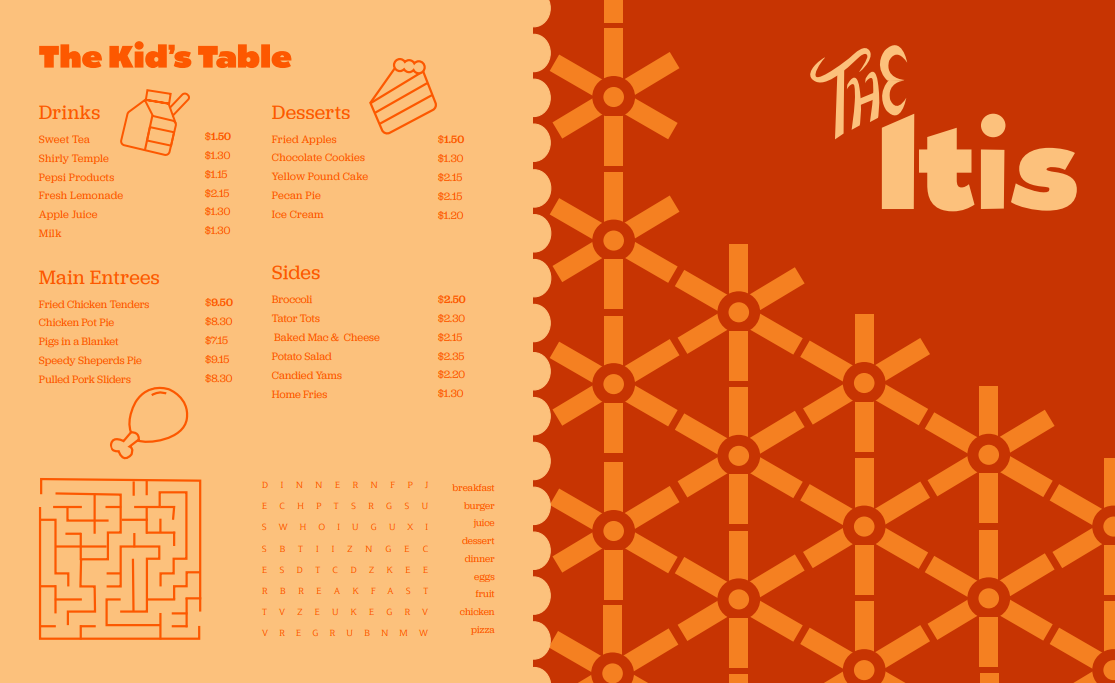
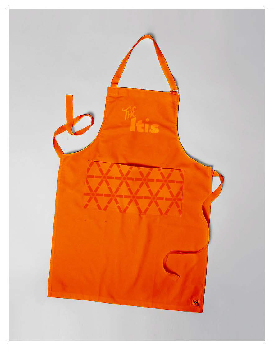
I took the typographic elements of the logo, particularly the "I" in "The Itis," and used them as the basis for creating bold patterns that would tie together the restaurant’s visual identity. By repeating and manipulating the shape of the "I," I developed a distinctive, graphic pattern that became a signature design element. This pattern was incorporated throughout the menu, as well as on promotional items like business cards, napkins, and packaging, adding a cohesive, eye-catching element to the brand. It helped reinforce the bold, dynamic feel of the logo while giving the restaurant a unique visual presence.
