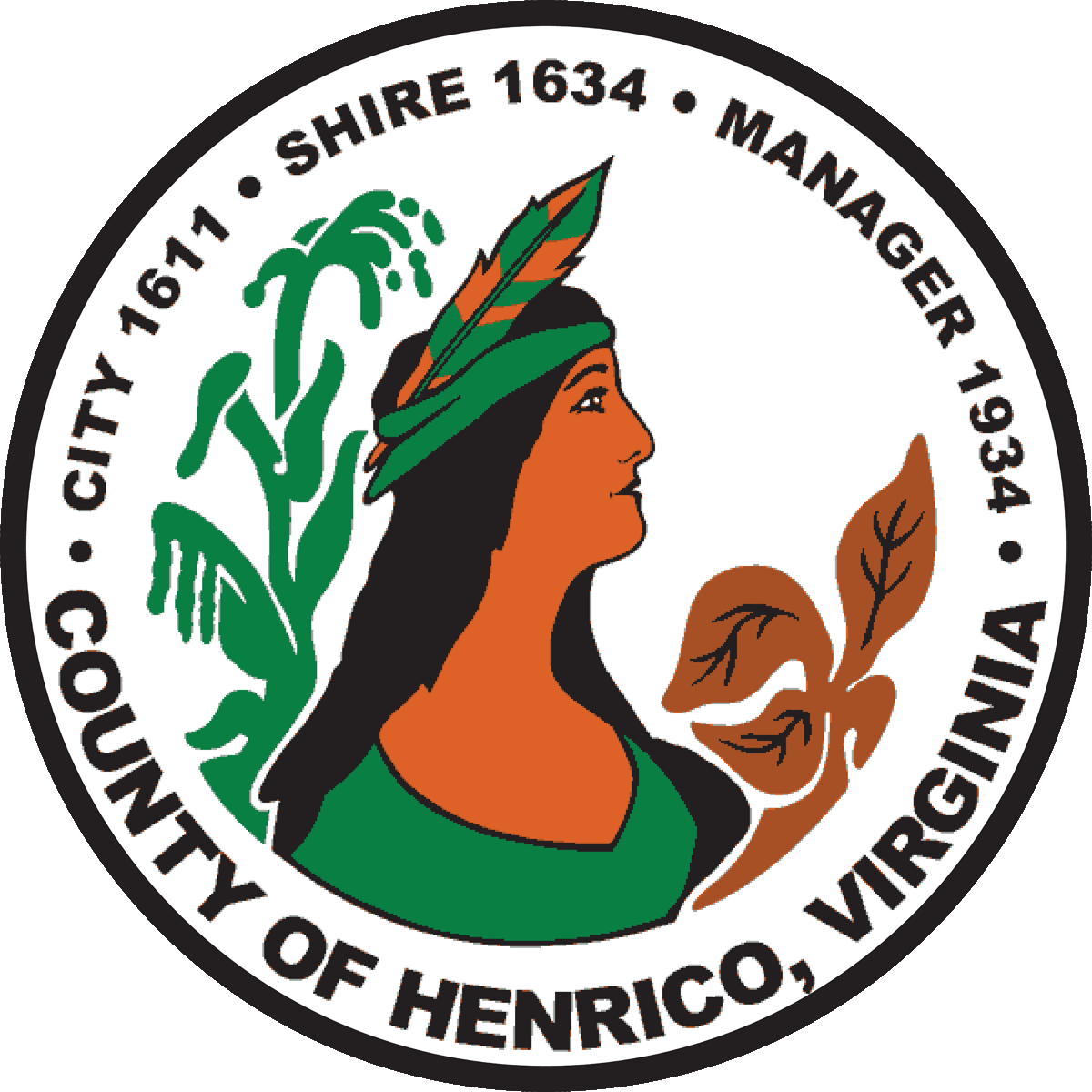
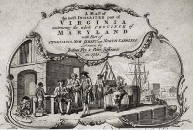
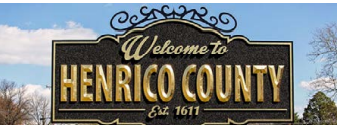
The rebranding project for my hometown of Henrico, Virginia, began with an analysis of existing and past logos and designs for the county. I carefully studied how previous visual identities reflected Henrico's history, values, and community image, identifying areas for improvement.
This research laid the foundation for creating a fresh, modern design that better represented the county’s evolving identity while staying connected to its roots.
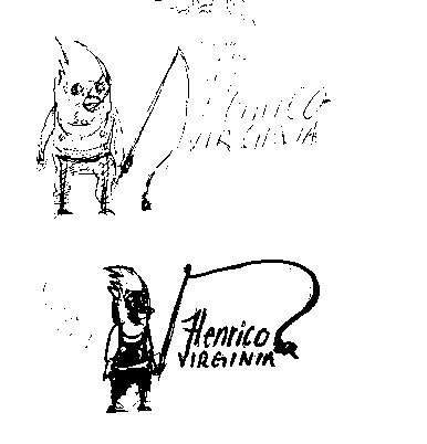
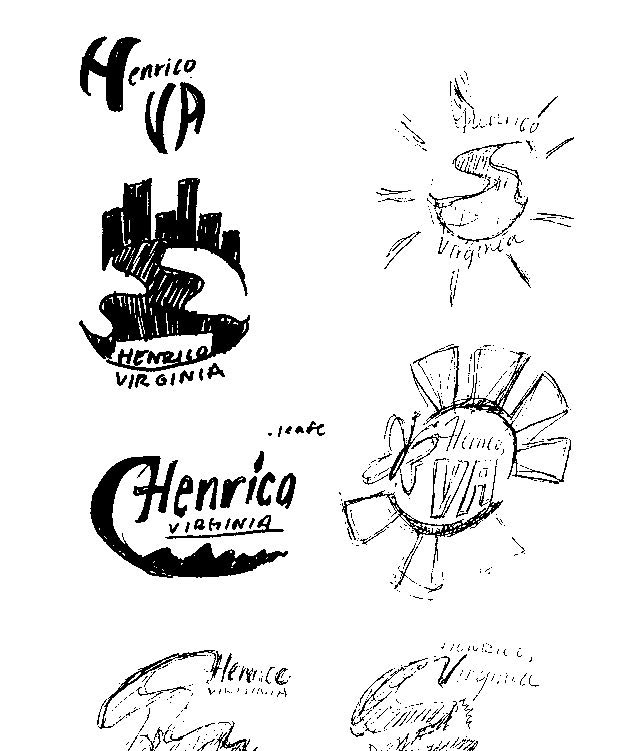
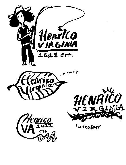
After studying Henrico’s earlier visual identities, I filled page after page with exploratory sketches rooted in the landscapes that shaped my childhood. I pictured Deep Run’s shaded trails, the shoreline of the James River at Osborne Park, and the open meadows of Three Lakes reflecting soft afternoon light. Those parks, rivers, and pockets of green space have always offered residents a quiet refuge and a reminder of our county’s deep connection to nature. I wanted the next evolution of Henrico’s brand to radiate that same sense of calm and belonging.
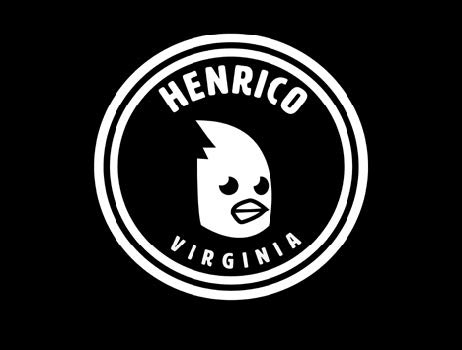
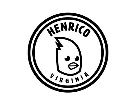
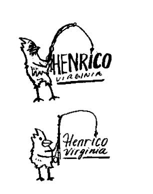
Midway through the process, an idea took flight: a cardinal mascot. Cardinals are constant flashes of color in our backyards, signaling both the vibrancy of local wildlife and the warmth of community gatherings. Naming the character “Cardinal Henri,” I shaped its form to feel spirited yet approachable, capturing Henrico’s welcoming personality. Cardinal Henri now anchors the refreshed brand, weaving together environmental inspiration and civic pride into an emblem that feels unmistakably, joyfully Henrico.
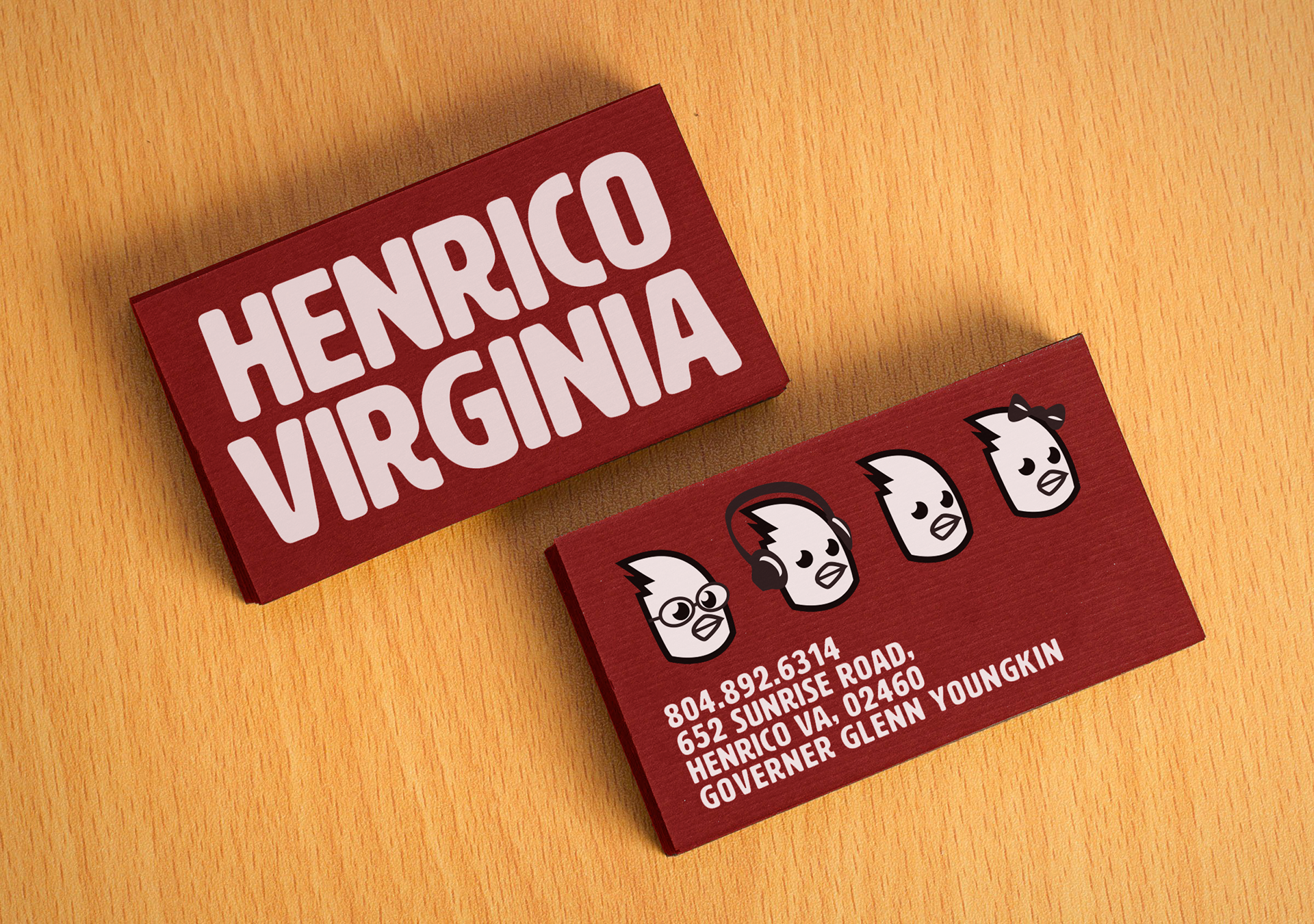
With the logo and core design elements locked in, I shifted to system‑wide implementation. First came the tangible touchpoints: business cards printed on uncoated stock to showcase the new color palette, letterhead and envelopes featuring a subtle watermark of the icon, and product packaging that used the brand’s signature typography for clean, modern shelf appeal. Each piece was carefully mocked up and refined, ensuring the proportions, whitespace, and hierarchy of information stayed perfectly aligned with the new visual guidelines.
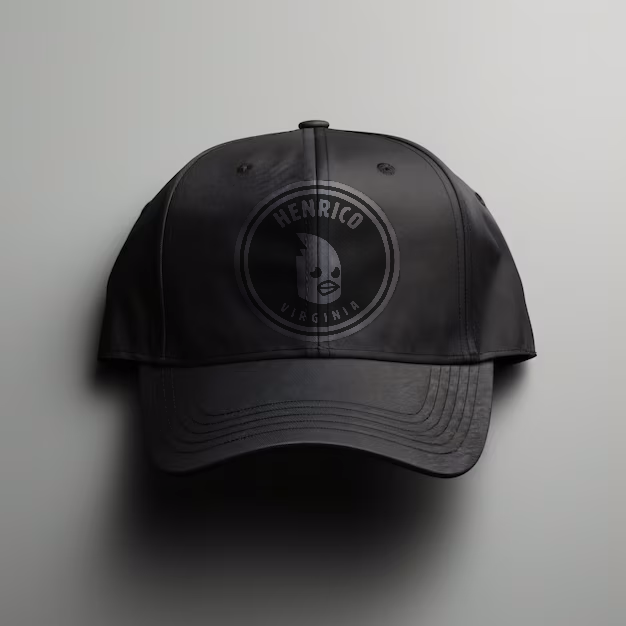
Next, I extended the system to digital and experiential spaces. The website’s navigation bar now carries the brand mark in a compact form, while social‑media templates incorporate the custom typefaces and color accents so every post looks unmistakably on brand. Email newsletters, point‑of‑sale screens, and event signage follow the same grid and styling rules, giving customers a seamless experience from first click to final purchase. By rolling out the logo, color system, and typography across every channel, the brand now presents a unified voice that’s instantly recognizable and consistently reinforced at every interaction.
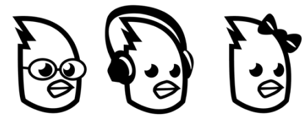
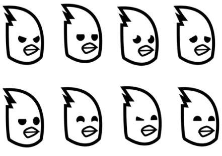
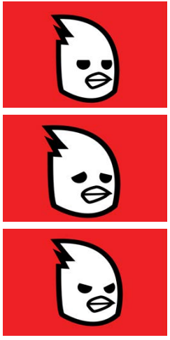
I used Adobe After Effects to bring my logo to life through animation, adding a dynamic element to the brand. By animating the logo, I was able to create a more engaging and memorable visual experience for users. After Effects allowed me to experiment with different motion effects, transitions, and timing to ensure the animation aligned with the brand’s tone and personality. The final result not only made the logo more eye-catching but also gave it a modern, professional feel that enhanced its impact across digital platforms.